7 Details for an Exclusive Home Interior That Looks Expensive
An exclusive home interior looks wealthy when it relies on quiet signals instead of loud ones. Those signals are deeper colour on large surfaces, muted saturation, light that reaches walls and ceilings, natural materials, visible empty space, edited groupings and confident scale. None of them depends on logos, gloss or a famous designer piece. They depend on restraint and coherence. That is why a modest budget spent on the right signals often reads as more expensive than a large budget spent on statement furniture.
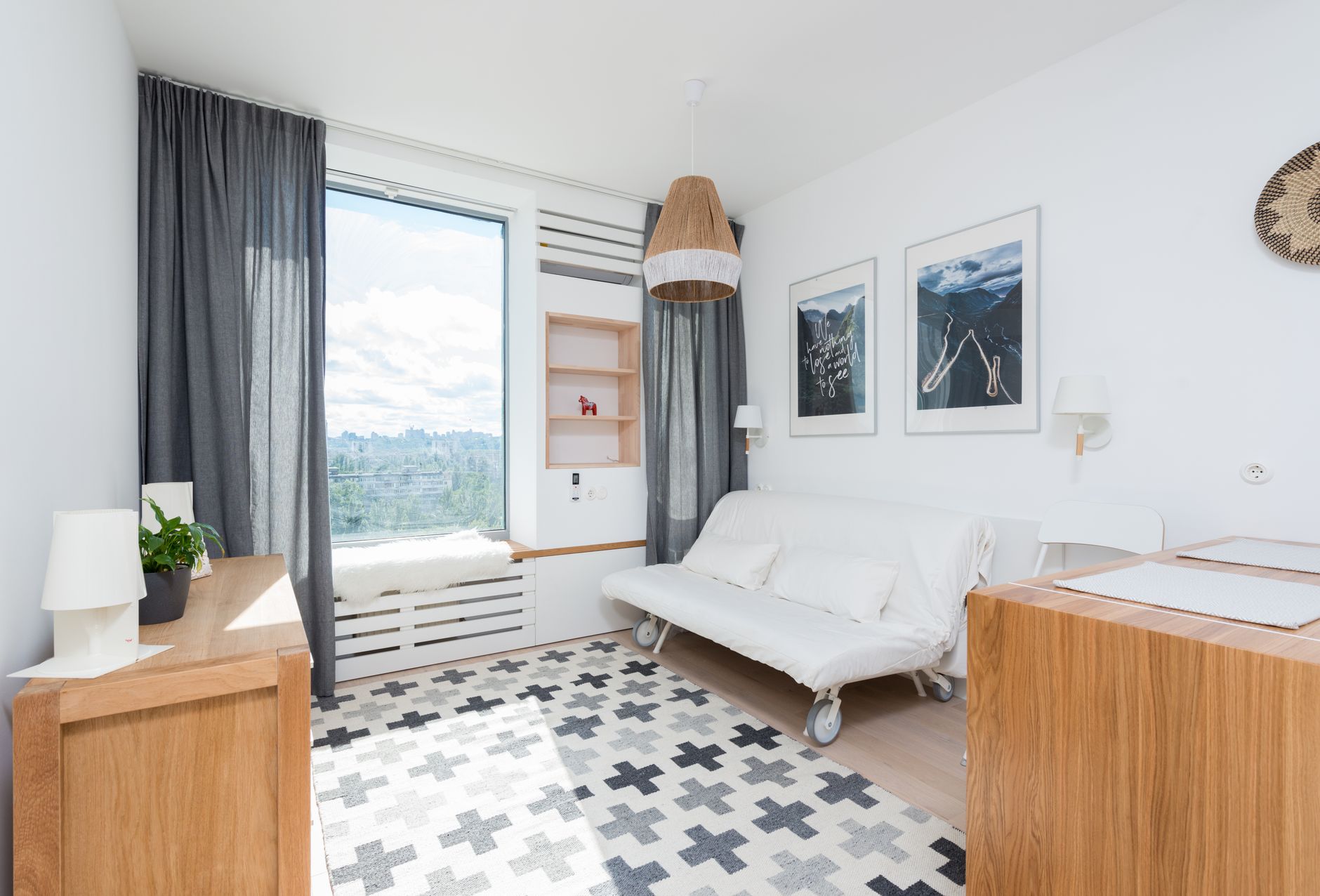
Why does a home look cheap even after spending a lot of money?
Picture a velvet sofa in a bright white room. One ceiling light hangs over it, and a shelf of mixed souvenirs sits behind it. The sofa may have cost a lot, but the room still reads as ordinary. A room is judged by its weakest signal, not by its best piece. Glare, clutter or clashing colours pull the eye away from the investment before anyone notices the quality.
Most overspending follows the same pattern. Money goes into individual objects while the setting (light, colour, surfaces, proportions) is left unchanged. Each new purchase also adds another colour, finish or style to the mix, so the room gets busier rather than richer.
What this means for your budget: before you buy anything new, ask which signal the room is currently failing on. Fixing that one often does more than any new sofa or side table. If you also want to know whether individual pieces are worth their price, these proof points for judging clothing and home décor quality cover that side of the decision.
Which design signals make an exclusive home interior look wealthy?
Seven signals appear again and again in rooms that read as expensive. Some come from published research. Others are long-standing design conventions, and the two are kept apart below.
1. Deeper colour on large surfaces
A peer-reviewed eye-tracking study in Frontiers in Psychology (2020) found that rooms were rated as more luxurious when a relatively large share of the space carried a darker hue, especially on floors or main walls. In practice, that might mean a smoked oak floor, a deep taupe feature wall or a large charcoal rug that grounds the room. A pale room filled with small dark accents does not have the same effect.
2. Muted rather than saturated colour
Research in the Journal of Consumer Research shows that less saturated colours raise how high-status luxury brands appear, and that this effect carries over to willingness to pay. Applied to a room, sage reads as more refined than lime, and camel reads as more refined than orange. The role of colour saturation in an exclusive home interior is worth a closer look if your palette feels loud.
3. Light that reaches walls and ceilings
The European lighting standard EN 12464-1 is written for workplaces, but its logic applies at home too. According to ETAP Lighting's explanation of the updated standard, it now recommends 75 to 150 lux on walls and 50 to 100 lux on ceilings to reduce harsh contrast. In a living room, that translates to wall lights, uplighters and lamps at several heights instead of one central fixture.
4. Natural materials and warm wood tones
The same Frontiers study found that wood and brown tones made a space feel comfortable and increased the desire to stay. The evidence needs some care, though. A University of Surrey review summarised by the Global Wellness Institute found strong support for natural elements such as plants and daylight, but limited evidence for natural materials as such. Linen, wool, stone and solid wood look expensive partly because they age well, not because science says they must.
5. Visible empty space
A study of more than 1,100 participants in the Journal of Environmental Psychology (2021) linked subjective clutter at home to lower wellbeing. Empty surfaces signal that a home has enough storage and enough calm, and both read as affluence. A bare stretch of console or an uncrowded wall makes the remaining objects look deliberate.
6. Edited, related groupings
Wealthy-looking rooms show fewer objects, and those objects are clearly related through material, colour or form. A shelf with three stoneware pieces in one glaze looks curated. Seven pieces in seven glazes look like they piled up over time.
7. Confident scale and proportion
Undersized pieces make a room look provisional. Examples include a rug that floats in the middle of the seating, curtains hung just above the window frame, or art that looks lost on a large wall. As a rule of thumb, rugs usually sit at least partly under the front legs of the sofa and chairs. Curtains are often hung closer to the ceiling than to the frame. Exact dimensions depend on the room, so measure before you buy.
Quiet signals or showroom display: which reads as more expensive?
There are two broad ways to make a home look wealthy. One is display: statement pieces, high gloss, strong contrast and visible brands. The other is quiet signalling, where the setting does the work. The table compares them on the points that matter for budget and long-term results.
| Aspect | Quiet wealth signals | Showroom display signals |
|---|---|---|
| Colour | ✅ Muted, deep base | ⚠️ Bright, high contrast |
| Lighting | ✅ Layered, walls lit | ❌ Single overhead source |
| Materials | ✅ Wood, wool, stone | ⚠️ Gloss, mirrored finishes |
| Surfaces | ✅ Edited, open space | ❌ Crowded with objects |
| Ageing | ✅ Improves with patina | ⚠️ Dates within seasons |
| Budget risk | ✅ Low, gradual spend | ❌ High, per statement piece |
The research above supports the quiet approach in a specific way. The Frontiers study found that extreme contrast between elements such as walls and floors tends to reduce pleasure, and display styling depends heavily on contrast.
What psychology explains, and what is styling convention
Gestalt psychology describes how people perceive groups. The principle of similarity says objects that share colour, material or shape are seen as belonging together. The principle of proximity says objects placed close to each other are read as one unit. Together, they explain why an edited grouping registers as a single composition while scattered objects register as noise.
Other popular rules come from practice rather than research. Grouping in odd numbers (the 3-5-7 rule) and building triangles of varied heights are useful habits that many designers rely on. They are not scientifically proven effects. Treat them as starting points to adjust by eye, not as laws.
A before-and-after example
Suppose an apartment owner has a 180 cm sideboard holding nine unrelated items: two framed photos, a brass candlestick, a glass vase, three small ceramics in different glazes, a speaker and a stack of mail. Nothing is ugly, but nothing groups together either.
The edit cuts this down to five pieces. A large stoneware lamp becomes the anchor, set off-centre. On one side, a subgroup of two pairs a tall vase with branches with a short stack of books. On the other, a subgroup of two pairs a low wooden bowl with a single candle in a matching tone. The speaker and the mail go into a drawer, and the photos move to a hallway wall. The open gaps between the groups do as much work as the objects, and the result costs close to nothing.
Which signals should you invest in first?
Start with the signals that cost little and change the whole room, then move to the ones that need real budget. Editing comes first because it is free and shows you what is actually missing. Many rooms look noticeably more expensive after half of the surface objects are removed, before a single purchase is made.
Lighting usually comes second. Two or three well-placed lamps and a wall light typically cost less than one quality armchair, and they affect every object in the room. Colour follows. Repainting a main wall in a deeper, muted tone is one of the cheapest ways to apply the darker-hue finding from the Frontiers study. Renters can get a similar effect with a large rug or heavy curtains in a deep shade.
Materials and scale belong at the end of the list because mistakes there are expensive. A correctly sized wool rug, full-length linen curtains or a solid wood dining table are long-term purchases, so they deserve measuring, samples and patience. A sensible rule is to replace one undersized or synthetic piece per season instead of redoing a room at once. That spreads the cost and keeps the palette coherent. When you assess a candidate piece, this guide on how to spot quality online helps you check construction and material before you commit.
The same order works whatever your style, Scandinavian, classic or modern. An exclusive home interior is less about which style you choose than about how consistently the seven signals carry through it.
FAQ
What is the 3-5-7 rule in decorating?
The 3-5-7 rule is a styling convention that suggests grouping decor in odd numbers, usually three, five or seven pieces. Designers use it because odd groups tend to look less staged than pairs. It is a practical heuristic rather than a research finding, so adjust the count to the size of the surface.
Do dark colours make a small room look expensive or just smaller?
Dark colour in small rooms can make walls seem to recede, especially when the ceiling and trim are in a related tone instead of stark white. The risk comes from low light, not from the dark colour itself. Pair deeper walls with lamps that light the walls, and the room tends to feel enveloping rather than cramped.
How much does an exclusive home interior cost?
The cost of an exclusive home interior varies widely, because the main drivers are rugs, curtains and large furniture, not accessories. Editing and rearranging cost nothing, while lighting and paint are relatively affordable. Spreading big purchases across seasons keeps both risk and spending under control.
What home decor reads as expensive in 2026?
Decor that reads as expensive in 2026 leans towards muted palettes, warm wood, textured natural fabrics and soft, layered lighting. These choices match the research on saturation, wood tones and contrast, so they are less likely to date quickly than high-gloss or neon trends. Buy fewer, better pieces that fit your existing palette.
Does a wealthy-looking home have to be minimalist?
A wealthy-looking home does not have to be minimalist, but it does have to look edited. A collector's room full of books and art can look rich if the objects share a colour thread and are grouped with clear gaps in between. What matters is subjective clutter, meaning how crowded the space feels, rather than the number of objects.
Where should you start with your own rooms?
Pick the room you use most, find the signal it is failing on, and fix that before buying anything new. Edit first, then sort out the light, then work on colour, and save materials and scale for last.
Combining interior pieces and fashion in one consistent aesthetic can make it easier to build a cohesive palette without browsing multiple shops. When you are ready to replace a piece that is too small, too shiny or too saturated, explore MEELANO's curated home and lifestyle collection and contact their customer service team for advice on what suits your room.
Conclusion
A home that looks expensive is rarely about filling it with costly things. It is about proportion, restraint, texture, lighting and a clear point of view. Start with what you already own, remove what is not helping, and make considered upgrades over time.
The most convincing rooms feel personal rather than staged. Let your space reflect how you live, then use quality materials, softer colour contrasts and well-chosen objects to give it a calmer, more polished finish.
Related reading: Luxury Home Decor Inspiration: Copy the Room or Learn the Rules?
Related reading: Unique Home Accessories: Why Fewer, Better Pieces Make an Interior Look Exclusive
Frequently asked questions
What is the fastest way to make a room look more expensive?
Improve the lighting and reduce visual clutter first. Replace harsh cool bulbs with warm layered lighting, clear unnecessary surfaces, and use larger lampshades or statement fixtures where possible. These changes can make even basic furniture look more intentional.
Which colours make a home look luxurious?
Complex neutrals tend to look more refined than bright, flat colours. Consider warm white, stone, taupe, mushroom, olive, charcoal, tobacco, deep navy and muted clay tones. Using several shades from the same family creates depth without making a room feel busy.
Can budget furniture look high-end?
Yes. Budget pieces can look elevated when the scale is right and the finishes are coordinated. Avoid overcrowding a room with many small items, choose simple silhouettes, upgrade hardware where practical, and pair affordable furniture with tactile materials such as linen, wool, wood, ceramics or aged metal.
What should you avoid if you want an expensive-looking interior?
Avoid furniture that is too small for the room, overly matching sets, excessive shine, visible cable clutter, undersized rugs and too many decorative accessories. A room does not need to be empty, but every item should appear to have a purpose.
Are matching furniture sets always a bad idea?
Not necessarily, but a completely matching room can feel flat or showroom-like. Mix finishes and forms instead: pair a timber table with upholstered dining chairs, combine antique and contemporary pieces, or use different textures within a similar colour palette.
How often should you update your home decor?
There is no need to redecorate frequently. Build a foundation with durable, timeless pieces, then refresh smaller elements such as cushions, artwork, flowers, throws and lampshades when your taste changes. This approach is usually more sustainable and creates a home with more character over time.
Sources
- Frontiers in Psychology (2020) — Pmc
- Journal of Consumer Research — Academic
- ETAP Lighting's explanation of the updated standard — Etaplighting
- Global Wellness Institute — Globalwellnessinstitute
- Journal of Environmental Psychology (2021) — Sciencedirect
- Spatial Color Efficacy in Perceived Luxury and Preference to Stay: An Eye-Tracking Study of Retail Interior Environment — Frontiers in Psychology / PMC
- Color of Status: Color Saturation, Brand Heritage, and Perceived Status of Luxury Brands — Journal of Consumer Research / Oxford Academic
- Upgrade your lighting: The new EN12464-1 standard explained — ETAP Lighting